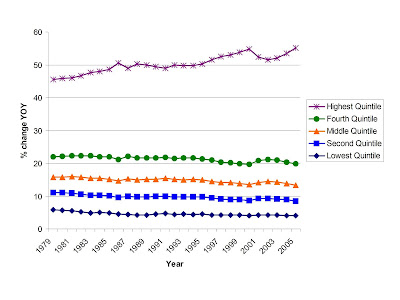
I made some figures from the data that they have available. This first figure lists the share of total income accrued by groups of income earners. The data is broken up into quintiles; that is, the bottom 20% is the lowest quintile, the people who accrue on average between 20% and 40% the total share of income per year are in the second quintile, and so on. Of course, the quintile to keep an eye on is the highest quintile, which represent the wealthiest 20% of our country.
Portraying the data this way reveals a particular pattern. The share of income in our country has decreased since 1979 for 80% of our country. This loss of income has been transfered to the top 20% of this country, who had 45% of the income in 1979 and now has 55% of the income in 2005.
These trends are even better illustrated in this figure:
 This illustrates the change in share of income normalized to 1979. If a quintile increased its share since 1979, then the value for the year would be positive. If a quintile decreased its share, then it would be negative. Zero would mean there is no change in the total share of income.
The bottom 80% all show the same trend: an equal loss in share of income. For the top 20%, there is an increase. Clearly tax cuts directed to the top earners is having its desired effect. The amazing thing is that the share for each of the bottom quintiles has decreased by about the same amount. So it's not like it's just the poorest of the poor are getting squeezed. Instead, anyone who is not rich is getting screwed equally, including the middle class.
Mathew Yglesias has some information on this here, and Kevin Drum expresses his jealousy for not getting a cool looking figure up fast enough here.
The CBO also has data breaking down the top quintile into finer categories. I'll be looking at those data a little more closely later today.


No comments:
Post a Comment