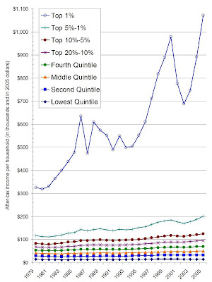
Some notes about what I did, first. I used the data that the CBO released last week. I used after-tax income; this is important because it is a more conservative assessment of income. If I used pre-tax income, the differences I show below would be even more exaggerated. In addition, given that some groups don't pay any federal income taxes, I felt it was probably better to use after-tax income so that we're comparing apples to apples. The data came from page 1C in their spreadsheet
Second, the CBO gives data in quintiles. They break down only the top quintile into smaller groups. Unfortunately, their breakdown is inclusive. Thus, their Top 5% includes the Top 1% and the rest of the Top 5%. I had to calculate the Top 5%-1% group by subtracting out the Top 1% from the Top 5% group, and so on.
Now to the data. This figure shows after-tax income per household since 1979. These are in 2005 dollars, which adjusts for inflation. Except for the numbers I calculated for the top percentiles, the raw data comes right off the CBO spreadsheet. (Sorry, no log scale. You want log scale? Make your own fig!)
 In 1979, the lowest quintile made $14,400 in 2005 dollars; the top 1% made $326,400, or 22.7 times more than the average person in the lowest quintile. As the figure above shows, this gap has widened. In 2005, the lowest quintile made $15,300; the top 1% made $1,071,500, or 70 times more than the lowest quintile.
I also wanted to know how income has changed over time since 1979. The fig below shows percent change in income since 1979 adjusted for inflation. As you can see, every group is making more money now than they did in 1979. Yet some groups are doing a little bit better than others.

The after-tax income per household in 2005 for lowest quintile is 6.25% higher than it was in 1979, adjusted for inflation. The after-tax income per household in 2005 for the Top 1% is 228.3% higher than it was in 1979, adjusted for inflation.
There are some interesting facts to point out. It's clear that the income for the Top 1% is especially sensitive to good times and bad times on Wall St. The sharpest drop-offs in their income comes during the 1987 crash and the 2000-2001 tech bubble implosion. Yet despite all of that volatility, they are making 228% more than they were in 1979 when adjusted for inflation. Not too shabby.
The lowest quintile also shows a very interesting pattern. the 80's were especially hard on the poor. Their income decreased for the first five years and was flat for the rest of the decade. The 90's saw an interesting turn around for after-tax income for this group. They saw substantial growth in their income through the entire decade, growing to 13.2% greater than their 1979 income in 1999. Their gains were so impressive that they almost reached the same growth achieved by the second and middle quintiles.
Yet, since 2000, fortunes for the bottom quintile have waned. They shed nearly all of their gains by 2003, when their inflation-adjusted income was only 4.17% higher than it was in 1979. The Top 1% also took a hit in 2003, sinking to only 128% higher than their 1979 income. Luckily they have made it all back and then some in just two years.
I'll do some more thinking about all of this. For the time being, all of this brings to mind a saying:
A rising tide lifts all yachts...


2 comments:
now one has too see how many of the people who were in the last quintile in 1979 stayed there. if most of them lifted themselves out to the next level they have shared in the expansion of the economy.
the last quintile may be very well be made in good part of young people at the beggining of their careers or by elderly who have saved less and live on very little or by immigrants who just started on the pursuing of their American dream.
there is recent IRS data that shows that 58% of the people in the last quintile in 1996 have risen to upper quintiles by 2005.
How much movement is there up quintiles? Is there enough to obviate the increasing concentration income in the highest percentiles?
Post a Comment